
Art making, like any other worthwhile endeavor, involves a series of incredibly difficult decisions that the artist must constantly evaluate and move forward with before fully executing a piece. Many abstract artists have devoted their entire careers to examining the decisions, or steps, involved in the creative act. Sol Le Witt is a great example – his quest to make geometric work from a set of explicit, linear guidelines raised questions about authorship and the relationship of command between the creator and the creation.
In my own work, I often find myself clinging to a flimsy skeleton of clear steps I’ve tried to create in order to feel as though I have some form of control over it. After enough time, however, I ultimately have to admit to myself that I’m at the mercy of the slow and meandering process that a thoroughly completed painting requires. Even the tasks that I anticipate being straightforward, like layering colors or adding detail to an object, will continuously move up or down on the list of priorities, perhaps eventually ceasing to be a priority altogether. New decisions create new problems, the map changes every day based on a number of largely emotional factors, what was a personal triumph yesterday is puerile and embarrassing today. The only thing you can do is try to squash the feeling that all the work that came before just “worked”, and at this moment, you’re simply fucked.
I’ve written before about the helpful role that time-lapse photos, journals and sketches can play in heightening an artist’s awareness of their own process. For me, a quick photo after a painting session serves as an instant placeholder marking each transition in the work’s evolution. I thought I’d pair the photos from a recently completed piece called “Minjok” with some stray memories from each session to reflect on my own ever-changing – and often times, in hindsight, comically tragic – mental state throughout it’s creation. My hope is that it will be healthy for me and, dare I say, interesting to others.
You could say I’m borrowing from the Bob Ross playbook here, whose soothing self-talk helped his tuned-in viewers understand why he didn’t want that tree in front of that mountain just yet. More importantly, he helped them realize that paintings, although they can feel truly magical, are in fact not magic, but the end product of a series of decisive actions.
I don’t anticipate this being anywhere close to as comforting as Bob’s words were, but if you’re at all interested in getting a peek into the neurotic hell-scape that is my mind while I scramble from point A to point B in the studio, riding that thrilling emotional roller coaster of total self-assuredness and crippling self-doubt, you’re more than welcome to read on:
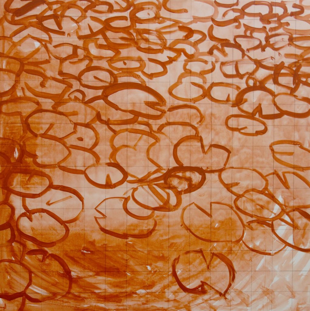
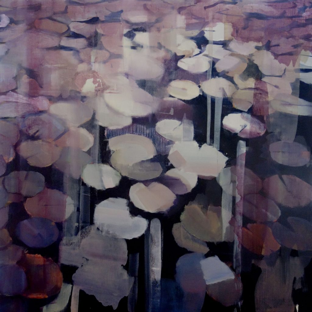
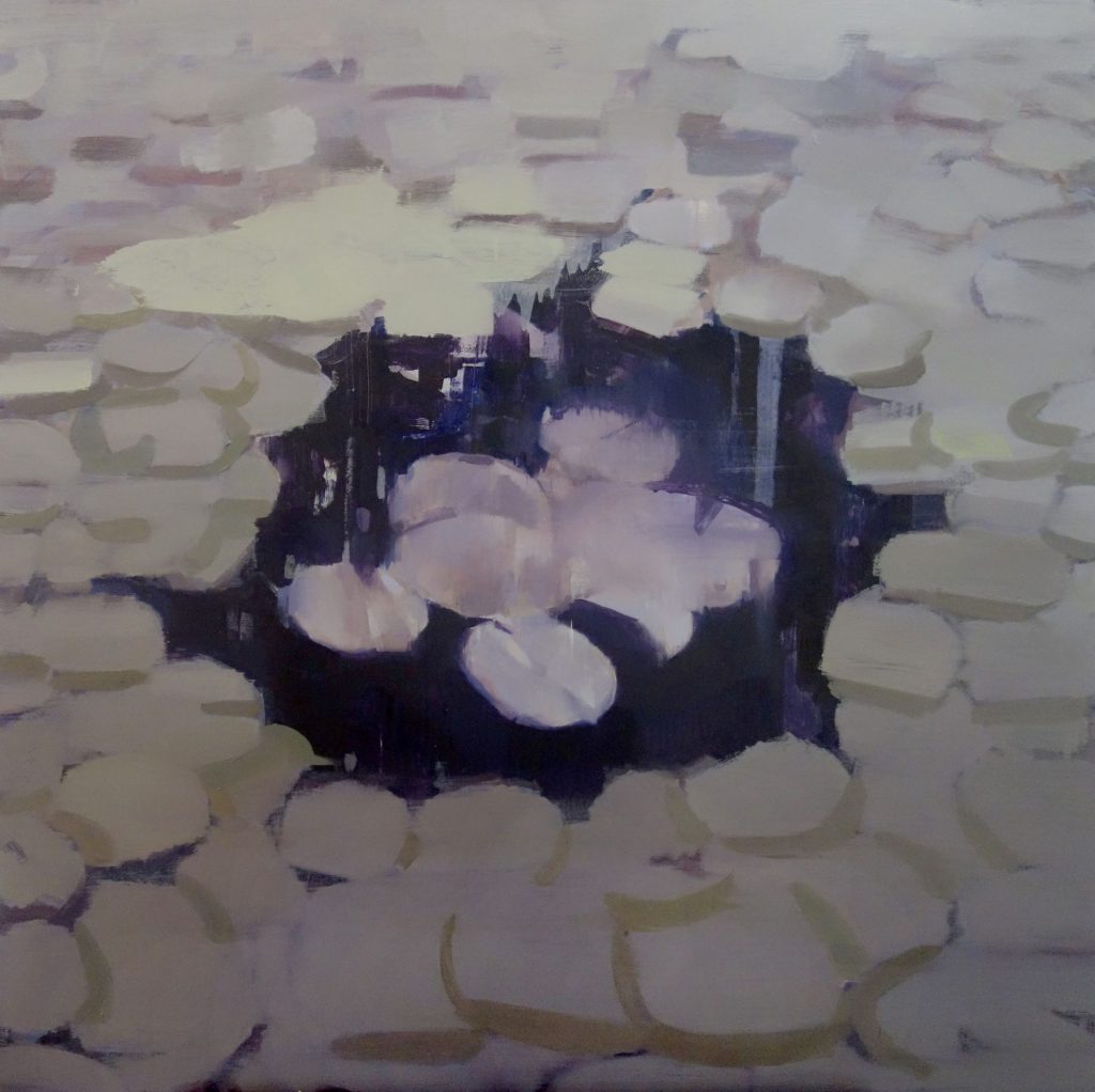
At the start of the piece, I’m working quickly and without to much thought about the end result as this is practically the only way I can get anything started. I have vague ideas about the composition and know that I want to take on the challenge of turning a potentially banal cliche like “Water Lilies” (especially in the context of South Korea) into something that keeps me engaged and carries emotional weight.
Now I’m hurriedly blocking in the lily pads with shades of green knowing I eventually want to depart from this and experiment with unnatural hues. I like the way the opaque planes of color create a sense of flimsy paper thin objects floating on a flat surface. I want to preserve their unfussy simplicity but I also want them to be gritty with texture to contrast the blunt, minimal composition and create a kind of loaded silence – I guess I’ll have to try and magically combine those two totally opposite qualities later.
The painting still being new and relatively untouched, it’s a great time to experiment aggressively with color. I’m using every tube I own and seeing what sticks, not staying on any one shape for too long and not thinking too much about tried and true color relationships, which will hopefully lead to some unusual hues. I’m applying the strokes in a way that suggests a collapse of the pads into the dark water, but I’m not sure if I should continue this vertical movement as the grey / sliver pads at the top are moving horizontally. Might it be interesting to have them moving in opposite directions or just awkward? Maybe I should start painting the colored pads to reflect the horizontal movement of the top half. Either way, I know I want to preserve the metallic, ghostly hues in the top half – the warping and melding effects are very much in line with the mood I imagined for this piece.
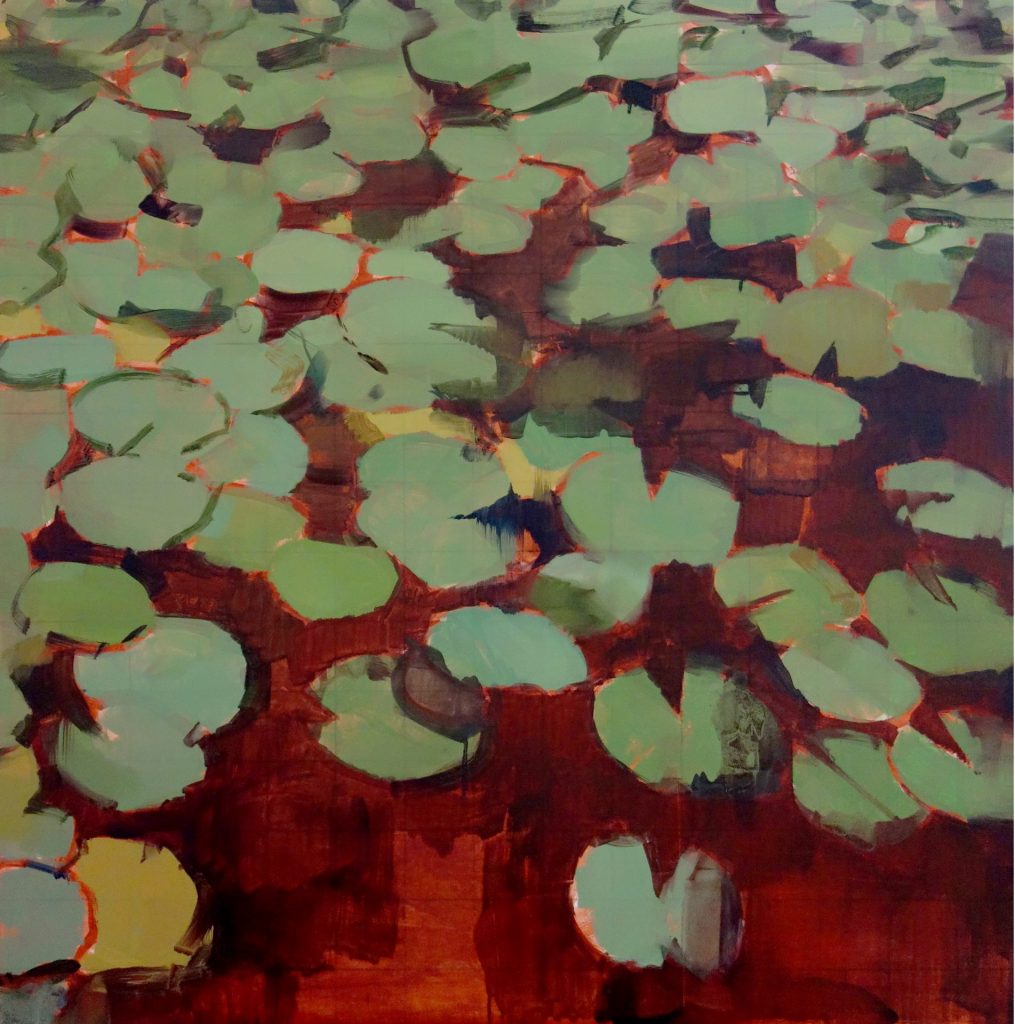
This session involves the first of a few painful decisions, namely the disappearance of the orgy of rainbow colors in favor of a more uniform palette. I picture a somber mood for this piece and the wildly differing pops of color are going to have to wait for a future painting. I’m liking the tones I’m seeing in the desaturated pads in the bottom half anyway, some more subtle than others but with that ambiguous rusted metallic quality and believable realism I liked in the top half. I like the new consistency in the piece, but I’d be lying if it didn’t feel like it lost some of the energy – risked surpassing subtlety and heading straight for dullness. I’m going to set this aside for about 3 months and concentrate on other work, largely because I don’t know where to go from here. I think I’ve settled on the title “Minjok” and I’m playing with a concept of ethnocentrism in South Korea, the more saturated pads representing racial diversity fading up to the lighter, paler pads representing racial homogeneity. It also looks a bit like the stray lower pads are attacking the upper mass, making me think of Korea’s history of invasion from surrounding countries. Still not sure how much I want to push this idea to the forefront.
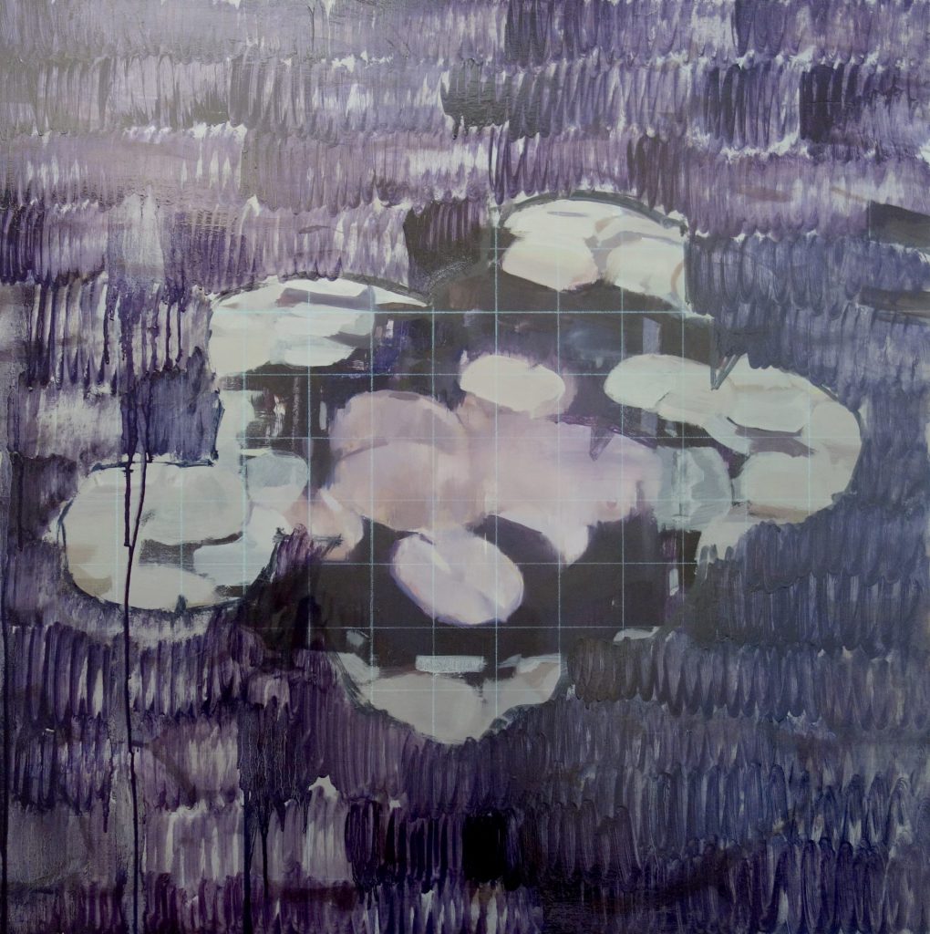
Time has passed and this makes the work feel much like it did in the beginning – open ended and not as precious – which encourages me to make bold decisions at the risk of ruining what I’ve done. I decide to start pulling down cool purples and crimsons so that the central mass of pads are highlighted and separated from the periphery, further alluding to the concept of “Minjok”. The transparent layers and dabs create a dreaminess that I felt was missing before and the central focal point seems to make a more powerful statement. I like the new pinkish whites in the central pads but they’re too simple – the edges are too precise.
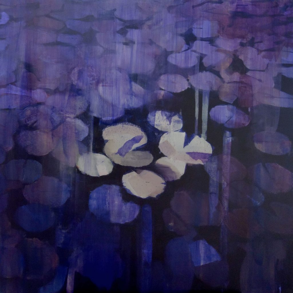
In reaction to increasing frustration over color choices, I pull down thick layers of ultramarine over most of the picture plane, hushing all the outside noise and moving closer to a simplified, subdued midnight atmosphere. Throughout the morning, this feels like an exciting turn for the piece and I think I’ve found my way again. By lunch time, I hate it and can’t believe how enthusiastic I felt hours earlier. It’s become too quiet, too simple, and I’m tempted to turn back. Unfortunately, there’s no returning to the previous stage without leaving traces of this decision. Did I just completely fuck up all my hard work? It’s possible, yes.
I can’t waste time trying to regain what was lost, especially when I wasn’t really in love with what was lost, so I’ll have to see this as an opportunity to change some important elements. I leave some ultramarine stained pads in tact and fill in the rest with new pads, slowly and subconsciously creating a wreath formation, the central pads, now truly melded together with a pleasantly melty pastel exterior, forming a distinct island apart from the periphery. Are the surrounding pads revering them? Attacking them? I’m not sure yet. I’m pleased with the lavender and silver tones of the upper pads, the lightened values on the shadows and defocused background quality, and a foreground and background seem to have appeared from all this, yet the central pads seem flat in comparison. Again, is this intriguing or confusing? Symbolically using perspective to distinguish the Minjok from the rest? I’ll have to sit with this, but I’m happy with where it’s at. Confidence is temporarily restored.
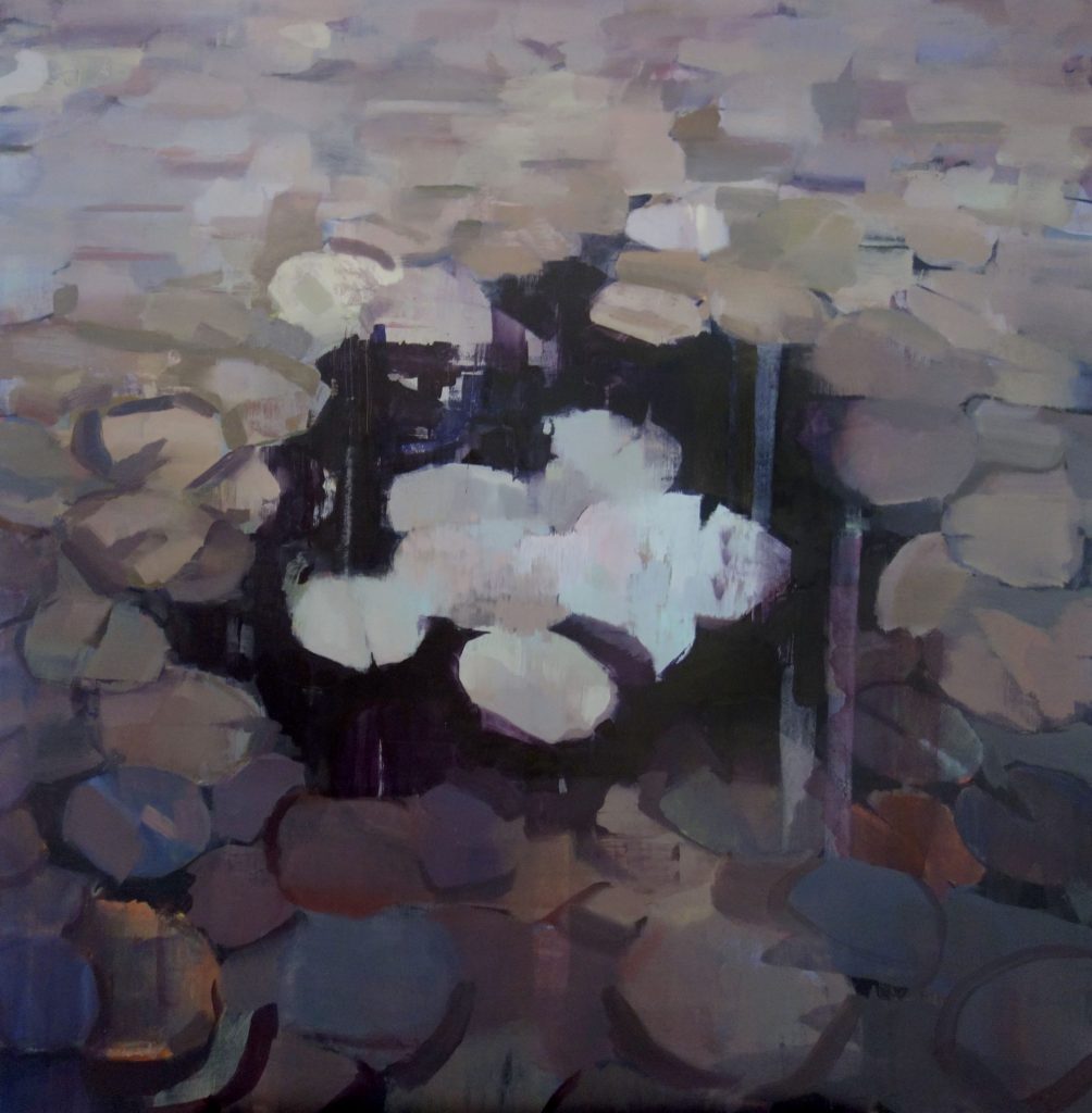
An attempt to bring back the silver tones to the central pads and create definition and circular movement in the periphery has backfired. During the session I feel I’m headed in the right direction and by the end I realize something has been lost. The lines look contrived, the colors are muddy and the perspective that I now realize is what made the previous stage exciting has disappeared. There’s a sensation of having spot cleaned certain areas to the detriment of the whole. The central pads that hours earlier felt otherworldly and vaguely nostalgic of some retro 80’s aesthetic now feel overworked and flat.
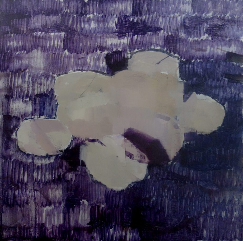
After 2 more sessions of noncommittal color adjustments to the periphery and a persistent sinking feeling that I’m fine tuning something that is inherently broken, I close my eyes and cover everything with a greenish gray. Hopefully this will serve as a base layer for a new silver periphery nuanced with dabs of technicolor hues similar to one of the central pads that I still actually like. Sure it looks boring as hell now, but I like the idea of a return to simplicity and will have to be patient as I work in some light values and create form. I’m concerned about the now homogenous palette working against the concept of the multicolored masses slowly integrating or creeping toward the central pads. I’ve finally solved the muddy colors dilemma, but to be honest the negative space between the central Minjok and the rest just feels odd and imbalanced. In fact, I’m starting to sorely miss the very first composition with no clear focal point, just a gradual vertical gradient with pads breaking apart toward the bottom. How did I get here and should I be pursuing this?
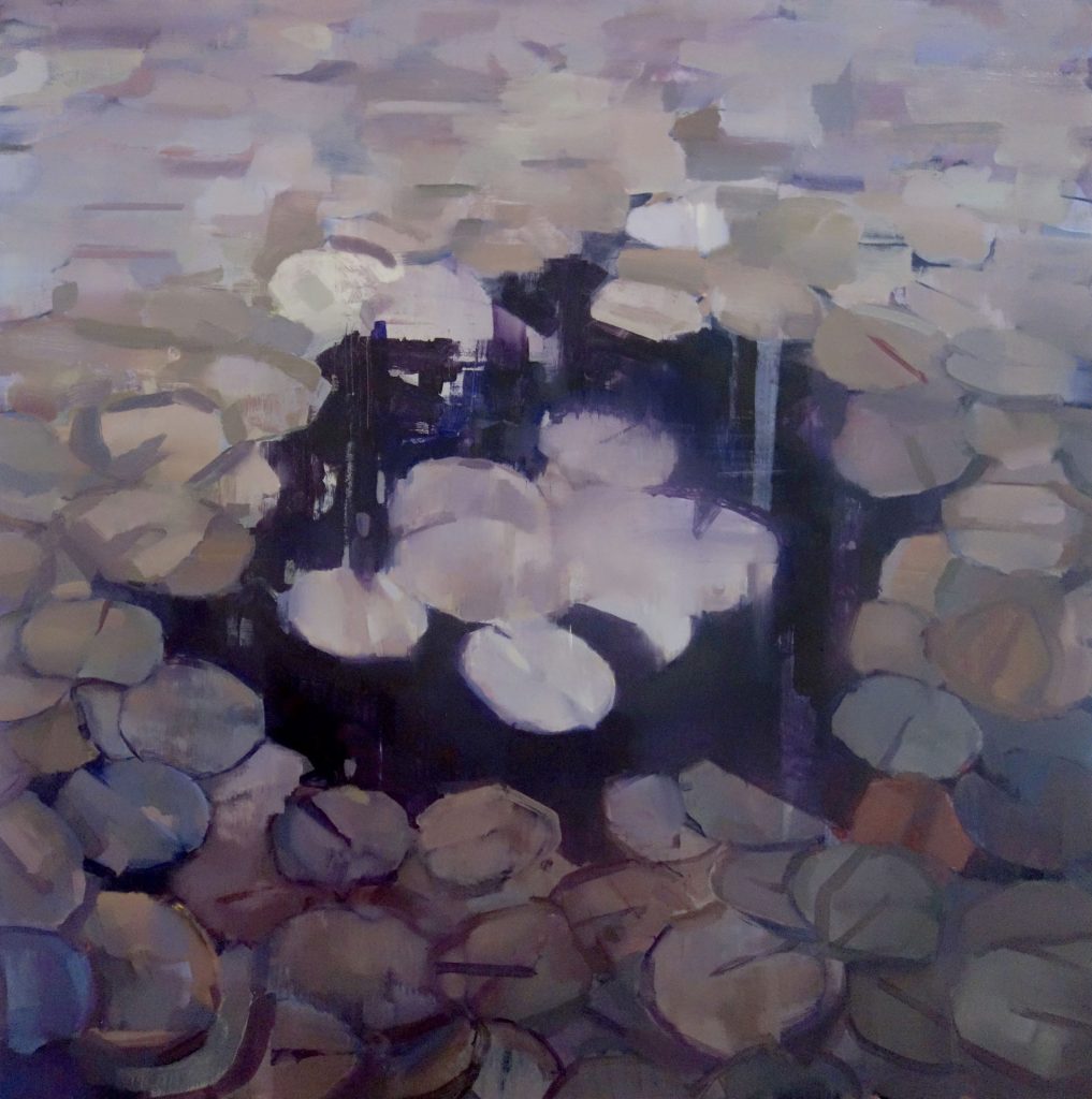
Time for yet another departure from what was – I’m going to explore a closely cropped composition that I’ve been playing with in sketch form but was afraid to pursue for the same reason I’m afraid to pursue anything risky – it won’t work and will waste time. I’m drawing a new grid and blocking in just a few pads that will now consume most of the picture plane. This excites me because it trims the fat of the peripheral mess and opens up new opportunities to focus on details and surface texture of the enlarged pads. I’m actually intrigued by the resulting image after blocking in – the smaller pads set within the larger ones. Will have to keep this idea on the back-burner for now.
Feeling much more confident about this direction. Although I’m essentially starting over, I don’t feel bogged down and overwhelmed by the details of 100 tiny pads and am anxiously awaiting the next session where I can dig into this and see where I get. I think the enthusiasm alone will cut the work time down significantly.
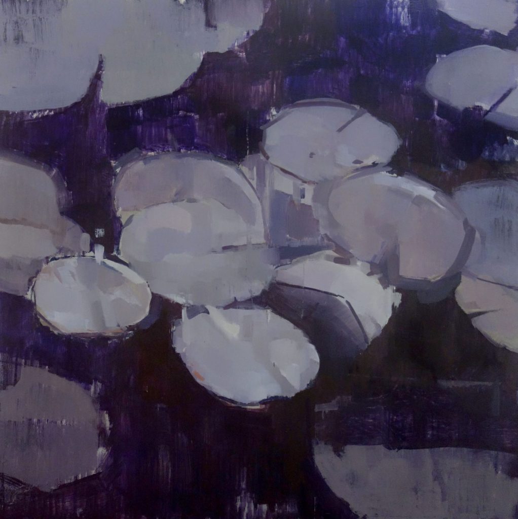
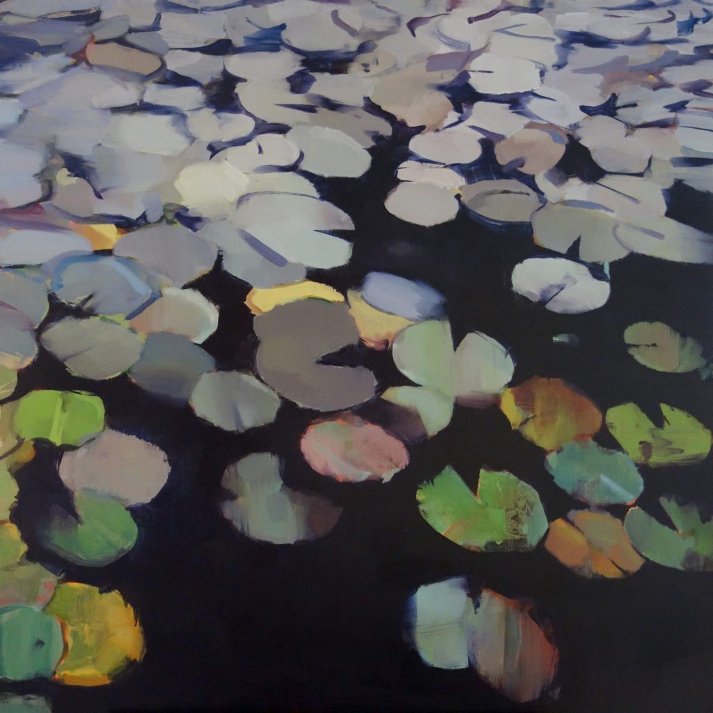
I lost a bit of the energy from the scrubbed vertical stokes in the background but I plan to find other ways to restore life to the black water. The values and textures of the pads are revealing themselves and the overall palette feels clean and refreshed in purple and silver. Going to have to find a way to eliminate some of the distracting surrounding pads without losing them entirely – adding intensity to the central pads with bold negative space while making sure the blackness is still activated in some way.
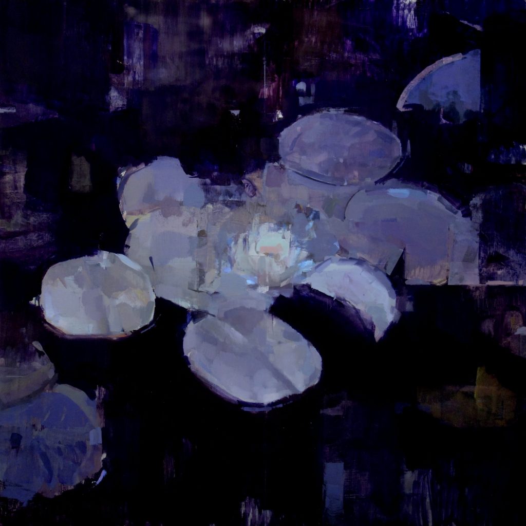
Despite my doubts about toying with yet another potentially cliche subject, I’ve brought in a water lily as the pads alone felt markedly blank. The flower was originally laid in using two source photos from Google Images but quickly strayed from its sources and came into its own, the end result of applying sporadic strokes, surface abrasion, standing back, and repeating. One dab made me think of moonlight passing through glass and I decided to bring in more of this, being careful not to overdo it. The tones are all working well on the pads and everything feels balanced, with hints of muted yellows, greens and blues peeking through the edges. There is a pleasing dark to light gradient from top to bottom that almost makes it appear as if the pads are being photographed with a flash. The water surface reads both as water and empty space, depending on what you’re looking for, and the surrounding pads have taken on an opaque geometric quality with suggestions of dim fluorescent lines overlaid.
I’m uncharacteristically satisfied with what I’ve done. The essence of the idea has morphed over time into sometime that feels deeper, more unified and more vivid than before. I hit tiny walls and obsessed over barely noticeable fragments during this last stage just as I had before, but they felt easier to push past and my hand felt more guided. I’m putting down my brush not because I don’t where else to take it, but because it now feels like a living entity I’ve formed a deep connection with that I’d be damaging with more work. It’s an honest expression, it says what it needs to, and it simply feels complete.